it’s not easy to get hold of Annie Brahler, the designer behind what might be the most famous office on Capitol Hill. The founder of Euro Trash, a design and import company that specializes in “the time-worn imperfections of the past,” Brahler is a busy woman. When we first spoke by phone this week, she was caught in a snow storm, driving home from work. During our second conversation, she was in the middle of an install, often politely excusing herself to speak with a colleague or an electrician who was on site.
Clearly, the onslaught of press attention surrounding Brahler’s so-called “Downton Abbey” re-design of Rep. Aaron Schock’s (R-Ill.) office has not slowed her down in the least.
Brahler’s work snared the political world’s interest this week when The Washington Post published a widely discussed story on Schock’s office, located in the House of Representatives’ Rayburn Office Building. One of the congressman’s employees told the Post that the unusual decor had been inspired by the well-known British period drama. But Brahler is quick to point out that “Downton Abbey” was not the model for her design. True, her company is known for its vintage aesthetic, but Brahler is more likely to raid the dusty corners of a flea market than the shelves of a pricey antique dealer. The stuffy Crawleys would probably not approve.
Of course, Brahler wasn’t designing for an aristocratic family, but rather for one of the youngest Republican congressmen, an up-and-coming lawmaker who understands the power of Instagram and can recite the immortal words of Taylor Swift. Brahler had designed Schock’s previous office as well, and knew that only an office drenched in red, accented by bits of gold and white, would do.
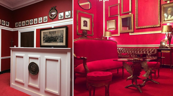
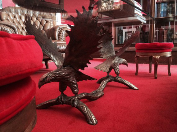
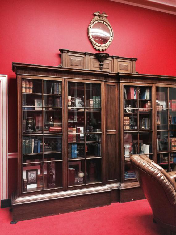
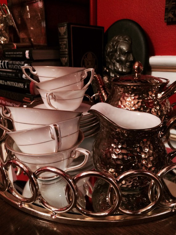
Peek at the below photographs of Schock’s recently completed office and you’ll see the ornate frames that line the walls, paired with carefully arranged pheasant feathers and presidential portraits. A vintage glass table rests atop two golden eagles with their wings spread. A bust of Lincoln lingers in a corner. The details — from leather-bound books to precariously stacked teacups to retro coins — were collected over several months’ planning, but installed in just four days.
Many outlets have questioned how Schock was able to pay for such a visually stunning office. Contrary to what some initial reports indicated, Brahler emphasized that she is indeed being paid for her services. And the decor she found for Schock was, like many of her other projects, chosen on a budget. Look a bit more closely at the photos and you’ll find evidence of Brahler’s resourcefulness: inexpensive reproductions of oil paintings bought online, velvet from Jo-Ann’s Fabric and furniture cleverly forged back together with J-B Weld epoxy. Oh, and that red paint? That’s from Home Depot.
“Aaron is open-minded enough to know that just because it’s inexpensive, it doesn’t have to look cheap,” Brahler said.
We spoke about the real inspiration behind her creation, what it’s like to hunt for furniture in Congress and the improbable wonder that is plywood.
How did you come to design Rep. Schock’s office?
I’ve worked for Aaron on projects for over seven years. His home in Peoria, his second congressional office and now this project.

Did he initially find you?
Yes, he found me. I think it was one of his assistants who initially contacted me. He saw my work and they found out that I lived in his district ... He loved my vision, so I did his residence first.
And then you designed a congressional office in the Cannon House Office Building for him. What was the inspiration behind that design?
I had never worked on any project in D.C, but I knew Aaron. I knew that he was young and really open-minded, yet conservative. I also knew that his work ethic was something that was a real inspiration to me. You know, the Midwestern work ethic is kind of unmistakable. I wanted Aaron’s constituents to know when they walk into his office what kind of person he is. Especially that he has this high energy.
So for the first office, I did things that [channeled] that kinetic energy. Pieces that moved your eye around a lot. The colors were navy blue and kelly green, but I kicked them up a little brighter than the typical Capitol Hill navy blue and green. I used a bright white to create a really great contrast. Everything was clean.
I always want every project to reflect the person that I am designing for and what they like ... Meeting Aaron and knowing him and designing his residence, I was very mindful of that. I had the benefit of never having worked on Capitol Hill, so I didn’t have any preconceived notions of that.
So for the Cannon office, you went with these really distinct blues and greens. And for his new office in the Rayburn House Office Building, you chose a very powerful red.
Yes.
And, to clear things up, the inspiration was not “Downton Abbey”?
No. You know, I have watched the show. I can’t recall a room that looked anything like this one. (Editor’s note: There is a room with a red wall featured in “Downton Abbey,” but other than the color, the room bears few similarities to Brahler’s design.) There are red walls in a lot of places. There’s also a red room in the White House, I found out.
This is how the red happened. It’s midnight. I’m bouncing back and forth with one of the staffers, trying to choose offices. [Schock] used to be in Cannon, which has this inherent, beautiful architecture. It brings me to my knees. It’s so beautiful. But the staff wanted him to be in Rayburn. Rayburn is very nice too; it’s marble and everything. But it doesn’t have that same feel. I’m looking at the new office that the staff really wanted. I was standing there, staring at the fluorescent lights and the beige colors and the corkboards on the wall, thinking, what am I going to do? How can I get the same depth of character that the other place had?
So, I thought, a strong color could do that. In the old place, I used navy, I used a vibrant kelly green, and I don’t want to do the same thing. I want to change things up. And all bright red came to mind, with gold leaf. I got that excited feeling I get when I know something’s good. I did think it might be a little out there for an office. But that made me even more excited, because it represented something really different. I knew Aaron didn’t want me to come in and just give him something normal. But it was midnight and you’re so fatigued and tired, so I thought I might as well ask.
I texted him the next morning and threw it out there. He goes, “Ummmm, didn’t see that one coming,” or something like that. I offered to throw it all up on a poster board with the colors and the gold, so that he could look at it and decide if he was willing to try it. He was. I found a red paint at Home Depot. And that’s where the color came from.
So where did the “Downton Abbey” reference come from?
I think there was an intern sitting at the desk when the Washington Post reporter was there, who mentioned that she thought the room reminded her of “Downton Abbey.” But it was not the design inspiration. If it was, I’d happily admit that. And I’m flattered that people think that. But my inspiration did not come from that show.
Tell me a bit about the key pieces of furniture in the space. Let’s start with the desk at reception.
The desk at reception has a very unromantic story. The guy who sits at the desk is very, very tall ... So I thought, why don’t we put him in a countertop desk situation? Because, you know, function is most important. Jill [Maurice, Brahler’s co-worker] and I were at the Home Depot, and they have these workbenches that are just plywood. The desk was, like, $74 and we put plywood around it, with molding on top, to sort of wrap the desk. Because I didn’t want to walk into the [office] space and just see the computer screens. We painted it white. And the medallion on the front is from the congressional gift shop. We painted it gold and hung it on the front for a focal point. And the stool he sits on — we got that at T.J. Maxx.
How much would you estimate the entire desk cost?
Probably about $150.
Above the desk, there’s an assortment of vintage-looking portraits that sort of greet whomever’s at reception. Tell me about those.
Yes. Those we bought for $6 total. I used double-sided tape from the Home Depot, the 3M kind, to hang them on the wall, because the wall is concrete.
Where did you find them?
From a thrift store [outside of St. Louis, Missouri]. They were in a cardboard box, with the same frames, but the glass parts were smashed, and there were pieces sitting at the bottom of the box. So Jill and I continued smashing them to remove all the glass. Then they were even lighter, and the double-sided tape would work. And without the glass, they look even older.
And once you enter Rep. Schock’s office space, take through me that.
Aaron did want, instead of a big imposing desk, something that was more of a table. He’s young, and he understands very clearly the technology stuff. He can work easily from an iPad, and he’s very approachable — not a stuffy D.C. kind of guy. So he didn’t want this big desk with a sign. He wanted a table that people could pull up chairs to and sit around and not have to go into a conference room.
We went up and down the dregs of Capitol Hill and couldn’t find anything that worked ... So we searched and searched and found one on Craigslist. We picked that up and hauled it in a minivan.
Was this one of the more expensive pieces, even though it was from Craigslist?
Yes, [though] there is a chandelier in the space. But yes, let’s just say this: It’s one of the few pieces of furniture we actually had to buy ... You know, other designers might have built one for thousands of dollars. Instead, we found an old table that a lady was selling in Virginia for a couple hundred bucks. We think it’s beautiful, and it works. We just weren’t hung up on buying pieces from a fancy furniture store or a pedigreed antique shop. We knew what it had to look like. Period.
Oh, and there are the pheasant feathers!
The pheasant feathers?
Somebody in another publication called them peacock feathers. They’re not. They’re pheasant feathers. We were doing a restaurant in Illinois and we wanted pheasant feathers to dress it for Christmas. Well, this lady we came across during the design of that restaurant had a bunch of feathers in an urn that we were looking at. We said to her, “Oh man, too bad we couldn’t find a bunch of pheasant feathers like these.” Well, it turns out, her husband and her son were big hunters and they had tons of pheasant feathers. And that’s where the feathers in this office came from.
Besides the pheasant feathers, another thing you can’t miss is the carpeting. The bold red.
Yes. Aaron paid for the carpeting. The House pays to put carpeting in if it’s certain colors, but they didn’t have a red. We both thought it was important to the design, so he paid to have the red carpet put in.
Did the House install it?
No.
For me, looking at this layout, I’m immediately struck by how much of a power room this is.
Yeah. Well, after I came up with the color, I thought about red being Republican. And I’m so apolitical, I did need to check with someone on that. But Illinois is a red state. Then I knew that we were definitely on the right track. So I liked that it fit.
Do you think the red color has anything to do with why staff and people outside the office have reacted so effusively to the design?
I think that’s why it got attention. Because it is so different.
For the staff members, I liked seeing pride of place when the staff and the interns who work for the office came in. When they started, they had slumped-over shoulders. But suddenly, they had little snappy ties on. They were proud of their office and they were proud of what they were doing. That’s why design can be so important. Your environment does affect you and motivate you. And making something that people are proud to work in is great. That made me very proud.
How about the couches throughout the office?
Most of the couches are from the inventory available at the House offices. There’s all of this furniture that belongs to the House of Representatives. When people are changing offices and new staff decide they don’t want to use the pieces that are already in an office, everything gets shoved in the hallway. You literally can walk the halls and say, “Oh, that sofa will work. Shove it the freight elevator and let’s bring it up.” Then you can also visit the House storage area — there’s a whole database of really cool, antique stuff. You can ask a woman in the storage area, “I need a desk chair.” And she’ll pull up a list. “Ok, you can take this one or this one.” And that’s what we did. The big bookcase is from storage, too.
Besides those pieces, there is also a red settee. We thought about the gold paint that we’d used in strips in the office — it looks like gold leaf. I thought it would be cool if we had gilded furniture. So we found a framed sofa and spray-painted it, the same thing with the two stools. And the red velvet, that’s from Jo-Ann’s. It’s a nationwide ...
Craft store.
Yes, craft store. The red velvet was hanging on a rack. It was near Christmastime, so it was pretty easy to find. We had a seamstress in Illinois upholster those three pieces. The total upholstery bill was $200.
Then there’s the eagle table. Jill was responsible for finding that. We were at an antique mall together. We found it at one of those booths that had so much garbage in it. I walked right by it, but Jill found it. It was about $175. In the last office, we had some eagle pieces ... and since I had spent so much time hoarding them for the last office, I wanted to use them again. We had to repair it with J-B Weld epoxy from Home Depot, because it was metal and it was cracked.
So in any other setting, it might be that piece is very tacky. But if it’s layered in the right way, it becomes something that people think is really fancy. And I take it as a big compliment that people think it’s expensive, but that is why I’m good at my job. I can take something that doesn’t resonate on its own and pair it properly in a thought-out design plan, and it becomes something important.
From your time on the Hill, what is your sense of a typical representative’s office?
There are a lot of members who will hire interior designers or carpenters to make the rooms more functional. But I think it’s typical of most designers in those buildings to make things blend in and look like a stereotypical image of a congressman’s office: mild. That is what most people try to do there and that’s not the way I roll.
So why do you think people are so quick to assume the vintage pieces in your design are so expensive?
My job is to create a feeling and to create an atmosphere. When something is beautiful or pleasing to the eye, a lot of people, especially the American public, they think it’s expensive. It’s just the way things are. One of my passions is to empower people, and let them know that something doesn’t have to be expensive to be beautiful.





Service Hotline
Work Time:Mon-Fri 9:00-18:00
UTC+8

Sinoexpo Digital Platform
Copyright 2006-2025 Shanghai Sinoexpo Informa Markets International Exhibition Co., Ltd. All rights reserved
沪ICP备05034851号-77
 沪公网安备 31010402000543号