Vitra
As little as ten years ago, the most reliable way to mainline new furniture news was to read a magazine product roundup, typically published four months after the news itself happened. And to be sure, magazine editors still pound the pavement to sort through thousands of pieces of furniture, endless interior arrangements, and scores of designer interviews to introduce their audiences to the [insert superlative adjective here] new stuff to put in their homes.
But with the advent of blogging, news began disseminating ever more quickly, almost in real time, and often in advance of the thing itself. "My favorite sofa from Milan furniture fair" takes about five minutes to post to the internet, as does copy/pasting press releases and hitting "publish." Now we’ve got Snapchat—behind the scenes, as it’s happening—in addition to sprawling Pinterest rabbitholes and the slightly more stylized Instagram. (I’ve yet to see anyone on Facebook care all that much about, say, ICFF.)
So what are interiors-obsessed reporters to do? We chronicle what we see, and like, as fast as we can, while taking careful stock of the visual cues that define our present interior zeitgeist. Here are a few of the tastier aesthetic morsels I’ve run across in the first half of 2016. And stay tuned for more on the broader picture: a move away from the conformity of all-white interiors, a growing focus on affordability, and a reliance on (with simultaneous anxiety about) the role of technology in our homes.
Speckled motifs
Polka dots: passé. This one's everywhere, from paint to furniture to upholstery to clothing to iPhone cases, and if I had to guess, I'd point to a recent rekindled romance with terrazzo as the starting point.
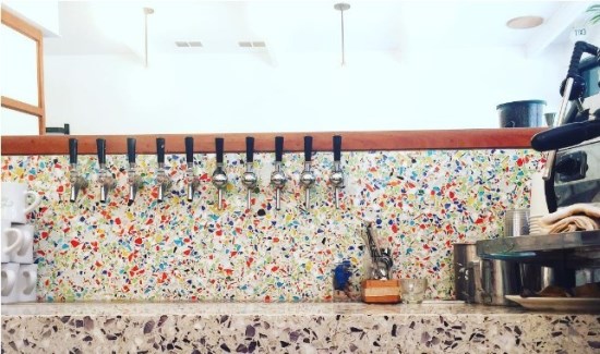
A photo posted by El Rey (@elreynyc)
Sofas on exposed frames
The only conceivable way to save money on a new sofa is buying one that flatpacks for cheaper shipping. But of course, flatpack doesn't suggest the comfiest of cushioned seating. Until now! The newest group of upholstered seating (psssst, we see your frames showing) involve a king’s ransom of swathed and scrunched pillows on top of a rigid structure.
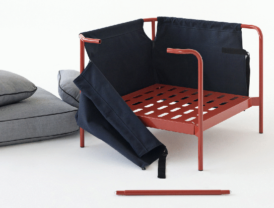
Can sofa and armchair for HAY, designed by Ronan & Erwan Bouroullec.HAY
Glamour’s back (and with it, metallic finishes)
Not that minimalism is dead, per se, but it’s taking a turn for the baroque. Metallic finishes, rich textures, low lighting, luxe vintage picks: This ain’t your California-meets-Scandinavian Instagram feed.
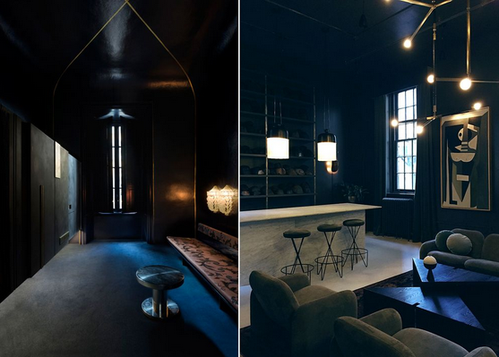
Two showrooms, in Milan and New York, best showcase this year’s turn toward the dramatic: Dimore Studio exhibited an impeccable collection of European antiques and its own custom upholstery in the duo’s studio, a Milanese palazzo (left). Apparatus debuted its new showroom, in Manhattan’s Garment District, offsetting its bold lighting in a moody mise-en-scene (right).Dimore Studio (left); Kelsey Keith (right)
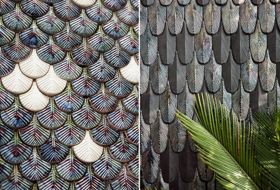
Botteganove, an upstart Italian ceramics company, showed its handmade, metallic-finished tile patterns at Ladies & Gentlemen, an exhibition during Milan Design Week 2016.
On that note, everything’s richer
You may be familiar with the Danish concept of hygge, usually typified in a space when cozy meets spare. Now even the Scandinavians are veering away from a strict monochromatic color palette and setting off blonde wood and pastel upholstery against bright jewel tones.
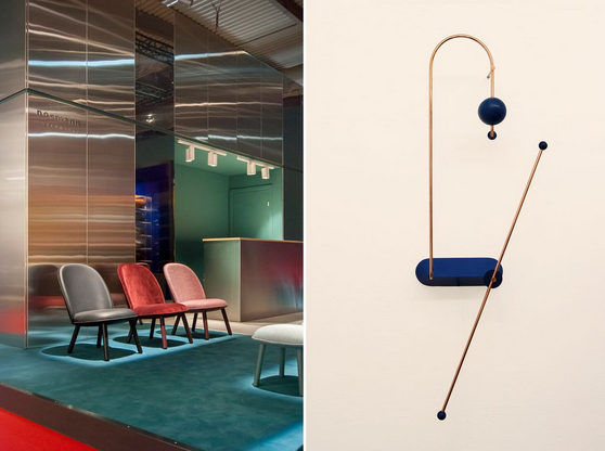
Normann Copenhagen’s booth at Salone de Mobile, Milan (left); Odd Matter’s Node light (right).
The color: rust
Each year, the design gods spin a giant Wheel of Fortune on which are painted a full range of "neutral" hues. The wheel has been on stuck on gray for the past five years, with slight derivations of the needle pointing to a pale, non-bubblegum pink. This year, the industry needle spun way back to the 1970s for a dip into rust. Paint, powder-coated steel tables, desk accessories, you name it.
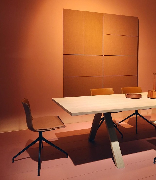
Rust: the new trendy color of the year. Our own @kelseykeith spotted this in the #Arper booth at #SaloneDelMobile.
Material innovation
One of the wildest things I’ve seen in action this year is something that’s noticeable for not being noticeable: Piero Lissoni’s Code kitchen for Boffi. The gas burners are set right into a marble countertop, or the seamless induction cooktop is embedded right into a Corian top. On the other end of the wowza material spectrum, designer Lex Pott brought his vibrant oxidizing process into play for a new line of La Cornue ranges.
Atelier Swarovski Home—which commissioned eight architects and designers (including the lateZaha Hadid) for an exhibition during Milan Design Week—debuted a passel of inventive applications for crystal like laser-jet-printed crystal and a proprietary technique called "wave cutting."
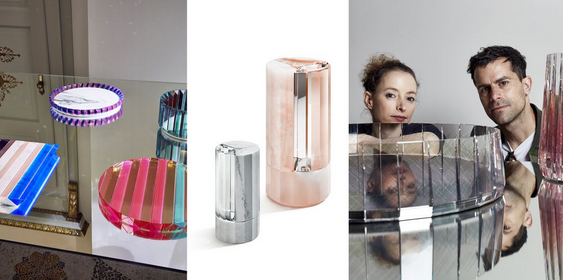
Tomas Alonso (left), Aldo Bakker (middle), and Raw Edges (right) with their innovative designs in crystal for Swarovski.
(Source: curbed.com Author: Kelsey Keith)






 沪公网安备31010402003309号