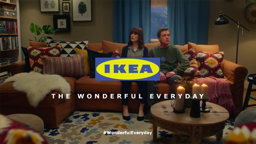
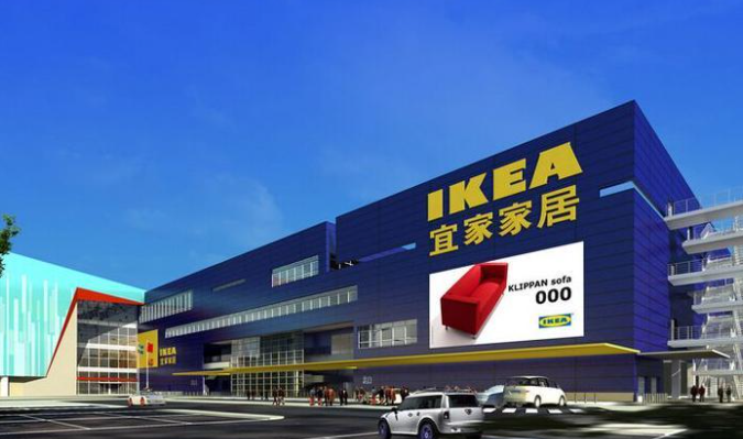
But the classic yellow and blue Ikea logo isn’t exactly the most flexible when it comes to design potential. So it has largely sat at the bottom right of Ikea’s famously minimalist print ads, or popped up in the middle of a TV spot’s closing frames, somewhat blocking your view of the action, such as in this closing moment from 2018’s “Ghosts” ad:
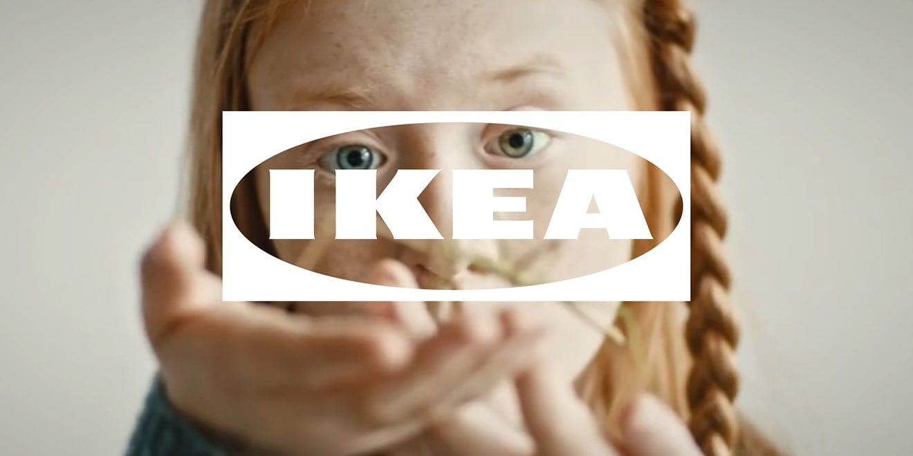
Now the global retailer and agency 72andSunny Amsterdam are rolling out a new spin on the Ikea logo, with a focus on transparency that enables it to work better over video content.
In true Ikea style, the new logo style has a quirky name: “The Fönster”—Swedish for “The Window.”
The Fönster won’t replace the classic blue-and-yellow Ikea logo, though we’re told that one’s also being “optimized” in as-yet-unspecified ways. Instead, the new design was specifically crafted to appear over moving images, such as TV spots, Instagram content or digital out-of-home.
Here are two examples the brand has released so far:
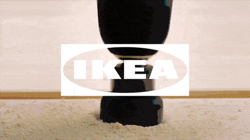
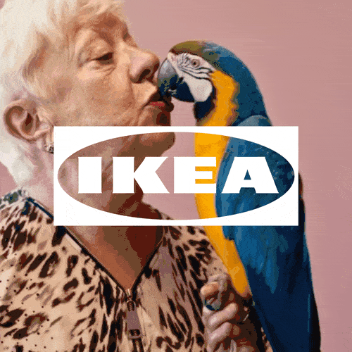
According to the agency’s description of the logo, its white coloring and transparent background allow it to integrate “into the beginning, middle or end of digital content, clearly signaling the IKEA brand and creating more opportunities to integrate the brand with emotional stories.”
While many of the new logo’s benefits are practical, the agency and brand also see a wide range of subtler aspects embedded in The Fönster.
“We have created a future-proof version of the iconic IKEA logo,” says Carlo Cavallone, ECD and partner at 72andSunny Amsterdam. “It has been optimized both in form and function, and is now more relevant and effective for the future touch points of the IKEA brand because it will open up a deeper—and far more emotional—connection between IKEA and a wide audience of people.”
With the new logo format, Ikea is better equipped for the video-centric world of modern advertising and better prepared for the formats to come.
“The Fönster represents an opportunity for IKEA to integrate itself with users and in the market place more than ever,” says Åsa Nordin, identity and symbols leader at Inter IKEA Systems (the company’s franchisor). “In a world where we can’t predict where IKEA will show up, we need a logo evolution that would allow us to be present and relevant in now and in the future.”


 沪公网安备31010402003309号